
The Investment Clock Explained
The clock will not tell you what the market does next quarter. It will tell you what kind of business survives the regime you are actually living in, including the rate regime the Fed is signalling next.

What is the investment clock?
The investment clock is a simple model of the economic cycle organised as a four-quadrant rotation: recovery, expansion, slowdown, recession. Each quadrant favours a different asset class: recovery rewards equities and commodities, expansion rewards equities and real assets, slowdown rewards bonds and quality, recession rewards cash and Treasuries. The clock is not a market-timing device; it is an allocation-bias device, telling you which way to lean rather than when to pull the trigger.
Merrill Lynch popularised the framework in the 2000s, but the intuition is older — Hayek, Mises, and the Austrians described roughly the same cycle in different language a century earlier. The version retail investors actually use today is a simplification: two axes, four quadrants, a handful of asset-class rules per quadrant. Simplification is the point. A model that needs a Bloomberg terminal and a derivatives desk is not useful to anyone running a personal book.
How is the investment clock different from market timing?
Market timing tries to call tops and bottoms in price. The clock tries to identify the regime, meaning growth direction (up or down) and inflation direction (up or down), and lean allocation accordingly. The forecasts the clock requires are not 'will the S&P be 5% higher in three months' (impossible) but 'is growth accelerating and inflation rising' (sometimes knowable from PMIs, employment, and yield curves). The first is gambling; the second is process.
Druckenmiller said the way to make money in macro is to picture the world eighteen months from now, ignore where prices are today, and position for the picture. The clock is the discipline that makes the picture nameable. You don't need to be right about every regime; you need to avoid being catastrophically wrong about the one regime where avoiding loss matters most — recession. The clock's biggest contribution to a long-horizon return is not the upside it captures in expansion; it is the drawdown it prevents in slowdown.
Which assets do best in each phase of the cycle?
Recovery (growth up, inflation falling): equities lead, especially cyclicals; high-yield credit re-rates; commodities turn. Expansion (growth up, inflation rising): equities continue but quality and value outperform speculative growth; real assets (real estate, infrastructure) work; commodities peak. Slowdown (growth down, inflation high): defensive equities (staples, utilities), long-duration bonds gain late, cash earns a real return. Recession (growth down, inflation falling): government bonds, cash, and select quality compounders that earn through the cycle outperform everything else.
Notice what is missing from each rule: gold. The clock is silent on gold because gold trades on currency debasement and real yields, not on the growth-inflation grid. Bitcoin sits in the same category. Both belong in a portfolio as small structural holdings, not as cycle rotations. If you find yourself trading gold on the clock, you are using the wrong instrument for the regime.
How do I know which phase we're in?
Three indicators usually agree before a phase shift. First, the yield curve: a steepening 2s-10s from inverted territory historically precedes recovery by 6–12 months. Second, PMI breadth, specifically new orders crossing 50 from below, signals expansion regaining momentum. Third, the unemployment trend: claims rising for three consecutive weeks is the most reliable single signal that slowdown is becoming recession. When all three agree, you have a regime; when they disagree, you have a transition, which is when you do nothing brave.
The PMI and unemployment indicators are public; the yield-curve indicator is on every financial-data site. None of this is hidden knowledge. The hard part is patience: the indicators turn six to nine months before the headline data confirms the regime, and the market often takes another two to three months after the indicators to re-rate. Investors who fade the clock are usually right about the direction and wrong about the timing.
What are the limitations of the investment clock?
Three. First, financial crises break the model. 2008 and 2020 telescoped multiple phases into weeks. Second, central-bank intervention has compressed the clock for a generation; rates moving from 0% toward neutral is itself a regime the original clock did not contemplate. Third, structural shifts (technology productivity, demographics, deglobalisation) shift the trend rate of growth, which the clock treats as background. Use it as a bias generator, not a deterministic schedule.
The honest application is to keep the clock as one of three or four inputs, not the only one. Combine it with valuation (a reverse-DCF that says the market is paying for 18% growth into a slowdown is more useful than a PMI), with credit conditions (high-yield spreads are the canary), and with leadership breadth (when the index is held up by ten names, the cycle is already further along than the averages admit). Use the clock as a bias generator and let bottom-up work do the picking.
Don't fight the Fed
The single biggest practical complication the clock investor faces is that the Federal Reserve sets the discount rate that translates the regime into prices. Growth stocks are the longest-duration assets in the equity market. Most of their value lives more than seven years away, in cash flows that have not been earned yet. A reverse-DCF on a compounder trading at a high multiple is mathematically a bet on the discount rate as much as it is a bet on the business; when the risk-free rate rises by a percentage point, the present value of cash flows in years ten through twenty compresses meaningfully more than the cash flow in year one. The mechanical receipt is the spread between the Russell 1000 Growth and Russell 1000 Value indices: it co-moves with the ten-year yield through every tightening cycle of the modern era. Tightening punishes growth. Easing rewards growth. Neither is opinion.
Marty Zweig codified the rule in the 1970s — don't fight the Fed. The asymmetric receipt: in tightening regimes, the average speculative growth name underperforms quality value by mid-double digits; in easing regimes, the spread inverts. The clock's slowdown quadrant is precisely the quadrant where the Fed typically holds or hikes against still-elevated inflation, which is why "growth gets punished in slowdown" is not just a stylised fact but a mechanical one: the regime forces the Fed's hand, and the Fed's hand forces the duration math. The investor who wants to own growth through a tightening cycle has to underwrite a business whose cash flows in the near term are large enough that the present value does not collapse when the discount rate moves. That narrows the eligible list dramatically.
The signal stack to read the Fed is public and the same for everyone. The dot plot updated at every FOMC tells you where the members currently expect the policy rate to land. The terminal-rate path priced into Fed Funds futures tells you where the market currently disagrees with the dots. The yield curve is the market's verdict on whether the Fed is ahead or behind the curve. When the long end rolls over while the short end is still rising, the bond market is telling you the Fed is about to break something. Underneath all three sit the inflation prints the Fed itself watches: core PCE, supercore services, wage growth measured by the Atlanta Fed wage tracker. And then the language — the difference between "data-dependent" and "considering further action" is itself a regime shift, because the Fed reserves the considering-action phrasing for when it has already decided. The Druckenmiller frame applies: position for the picture eighteen months out, not the picture the FOMC dots show today. By the time the rate cut actually lands, the rotation is already half done.
How Invest Board reads the cycle
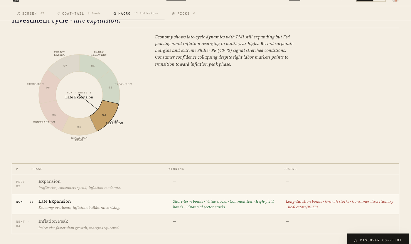
The Discover · Macro tab carries the investment-cycle wheel as a seven-phase rotation (Policy easing → Early recovery → Expansion → Late expansion → Inflation peak → Contraction → Recession) with a NOW · phase N pointer and a confidence percentage. The phase isn't derived from a single indicator; it's the weighted read across twelve macro inputs: credit conditions, capex trends, employment dispersion, the yield curve, the equity-yield-vs- T-bill spread, the dot plot, the inflation prints, and the rest. The confidence number tells you whether the indicators agree (high confidence, a real regime) or whether you're in a transition where the signals are split (low confidence, don't size bravely). At capture time the page reads Late Expansion at 78% confidence; the Fed has been holding against still-elevated inflation; growth has been the regime's casualty.
Beneath the wheel a Winning / Losing asset table translates each phase into the asset classes that have historically led and lagged. The seven-step chain, distilled from the canonical Investment Clock sequence on the Process page:
- Early recovery · equities (especially cyclicals and small caps), real estate, credit lead; cash and defensives lag.
- Expansion · equities, real estate, corporate bonds lead; cash and long-duration government bonds lag.
- Late expansion · commodities, inflation-linked assets, value stocks, energy and materials lead; long-duration bonds and high-growth equities lag. This is the don't-fight-the-Fed phase.
- Inflation peak / stagflation · gold, commodities, real assets lead; equities (especially growth) and nominal bonds lag.
- Contraction / slowdown · cash and defensive sectors (utilities, healthcare) lead; cyclical equities and commodities lag.
- Recession · government bonds and high-quality fixed income lead; risk assets (equities, high-yield bonds) lag.
- Policy easing → recovery restart · bonds first, then equities as growth returns; cash and commodities lag until the next inflation print arrives, and the wheel restarts.
That table is the service's job. The reader's job is still bottom-up underwriting: to put a name on every position that earns through the phase the macro page is calling. The macro page just answers what kind of business survives the regime the reader is actually living in. Pair it with the discount-rate read above and you have the two halves of the cycle question: which asset class to favour, and which duration bucket inside that class the Fed is going to vote on next.
Should retail investors actually use the investment clock?
Yes, but at low intensity. The largest mistake retail investors make is to ignore the cycle entirely and own the same equity allocation in every regime. The second largest mistake is to over-trade the cycle, rotating with every PMI print. The discipline that works is to lean 5–10 percentage points more or less equity than your strategic baseline, depending on where the clock says you are, and to keep the holding-period long enough that you compound through the regime rather than reacting to every monthly print.
The two largest mistakes are mirror images of each other, and both cost the same amount of money over a decade. The investor who never adjusts allocation to the cycle eats the full drawdown in every recession. The investor who over-trades the cycle eats transaction costs, tax friction, and missed re-rates in every transition. The middle path (lean five to ten points around a strategic baseline, re-evaluate quarterly, never act on a single data point) captures most of the cycle's benefit at most of the cycle's cost. Most of, in both cases, is good enough.
How does the clock fit with stock-picking?
It frames what you can expect from the bottom-up work. A quality compounder bought during expansion at a premium multiple will compound through slowdown and recession because the business earns through the cycle — that's exactly the bet. A speculative growth name bought during recovery will be punished hard in slowdown because the multiple was already pricing perfection. The clock tells you what kind of business survives which environment; the bottom-up work tells you which specific business inside that category to actually own.
This is where the clock and the six-dimension scoring methodology meet. Moat, management, and business-model quality are what determine whether the company you own actually earns through a recession. The clock tells you when the recession is becoming likely; the quality scores tell you whether the position you hold will be one of the survivors or one of the casualties. The bet, in the end, is always on the business — the clock just tells you what the business is up against.
How does Fed policy interact with the investment clock?
Heavily, and asymmetrically against growth stocks. The clock describes the regime; the Fed sets the discount rate that translates the regime into asset prices. When inflation prints hot and the Fed tightens, raising rates or signalling that the terminal rate is higher than markets had priced, long-duration assets get punished most, and growth stocks are the longest-duration equities. Their value lives years from now; a one-point rise in the discount rate compresses next decade's cash flows meaningfully more than this quarter's. Conversely, when inflation cools and the Fed pivots toward easing, growth stocks rally first and rally hardest because the same duration math runs in reverse. The Wall Street rule is 'don't fight the Fed': when the Fed is tightening, fade growth and lean into quality value, cyclicals, or cash; when the Fed is easing, the growth complex is back on. Watch the dot plot, the yield curve's verdict on terminal rates, and the Fed's own language. The market typically front-runs the policy turn by six to twelve months, so by the time the rate cut actually lands, the rotation is already half done.
What this means for your watchlist
Look at the top five positions in your portfolio today. If the clock says we are entering slowdown, can each business earn through it? Free cash flow positive in 2008 and 2020? Net debt under three times EBITDA? Pricing power independent of GDP? And the duration question: what fraction of each position's value sits beyond year seven? Names that fail that test are the ones the Fed gets to vote on. The names that pass are the ones you size in; the ones that fail are the ones you trim before the regime forces you to. That is the clock doing its actual job.